Saturday, 19 December 2009
Rough Cut - Teaser Trailer
Overall the sequencing of shots works pretty well, especially the last shot. The sound that accompanies this shot also helps to create suspense and to build up tension, as the girl appears to give a sinister character.
However throughout the teaser the trailer the sound does not accompany the moving images as supposed to a horror trailer. To improve this is would either use more sound affects to create a sense of thrill building up throughout the trailer, or to use a sound track that creates suspense and tension.
The moving images do speed up however the sound is what creates the thrill effect. Therefore to improve it would appropiate to add more sound effects to increase the tension, to follow the images.


Wednesday, 16 December 2009
Plan For the Day
Where I am at so far and What needs to be done.
Trailer - One scene needs to be filmed. Re-editing of what I have already done, as the shots are too long. Then I need to add sound effects, which will be completed after adding the titles.
Poster - Photo has been put on the poster, with the background and the name of the film. I just need to add the credits at the bottom of the poster.
Magazine - Photo has been placed on the cover, with the masthead, and a few teasers. I have add a few more, and may have to change the background colour.
Period 1 - Filming
Period 2,3,4 - Importing and editing of clips
Period 5 - Complete poster
Period 6 - Complete magazine
Tuesday, 15 December 2009
Testing Music With Clips
The last few shots are small clips which increase the tension to add to this, I added a music clip that increases the tension and suspense. The last shot is hand held, which creates an uneven effect between the way in which the character is represented, and how the hand held effect subverts this view.
Thursday, 10 December 2009
Poster Steps
To start of with, I took a photo which I want my audience to focus on. As it would give a hint of the narrative as well as the text that has been used.
I used the magic brush tool to erase the background of the photo, as I wanted to create a floating/hovering effect. This was to suggests her loneliness, and her being drifted away in here dreams. Below is the final image that will be used on the poster.


I then added the text to the poster. after completing. there were many things missing, as it looked very empty. Therefore I looked back at my the poster research and sub genre I noticed that were many things missing.

I have changed a few things from the photo above. These include the style/colour of text, and positioning of others, and also many other add-on's.
I used the magic brush tool to erase the background of the photo, as I wanted to create a floating/hovering effect. This was to suggests her loneliness, and her being drifted away in here dreams. Below is the final image that will be used on the poster.
I then created another page. The size of it is A3 with a white background. I dragged the image of the bed into this paper and placed at the bottom. This was because I wanted to create a black halo around her. To do this I used the halo gradient tool. I changed the settings so that it said foreground to transparent. Below is the outcome of using the gradient tool.

I then added the text to the poster. after completing. there were many things missing, as it looked very empty. Therefore I looked back at my the poster research and sub genre I noticed that were many things missing.
I have changed a few things from the photo above. These include the style/colour of text, and positioning of others, and also many other add-on's.

I have changed the style of the text "Sweet Dreams", the colour is yellow so that it stands out on the black background. I have added the stars names on the top of the poster, they are not in any order therefore one has the same attention as the other three.
Under the photo I put the credits which is reoccurring on many other posters. I also noticed that the they are in different fonts, the job title and the name of the person is in different text.
The certificate is also added in the bottom right corner of the poster. This is so that it appeals to the right target audience.
Magazine Steps
Here is a step by step on how I completed my magazine front cover. Below are print screen to show the steps at which I took.
 Here are the layers showing the order in which it needed to be placed so that everything could be seen. This was done in the reverse in which a person would put together a magazine. For example the background is the first thing that needs to be done so that everything else can be placed on top of it. Therefore this layer is at the end on the list.
Before started with the magazine itself, I had to use the eraser tool to get remove the uneven background. Below is a print screen showing how the tool works.
 Once this was finished, it led to the step of the print screens below.

 The first steps that I took were to get my canvas size. Looking at the image in the left it shows the sizes in inches, the width being 8.267 and the height being 11.693, making it an A4 size paper.
 Here are the layers showing the order in which it needed to be placed so that everything could be seen. This was done in the reverse in which a person would put together a magazine. For example the background is the first thing that needs to be done so that everything else can be placed on top of it. Therefore this layer is at the end on the list.
Before started with the magazine itself, I had to use the eraser tool to get remove the uneven background. Below is a print screen showing how the tool works.
Once this was finished, it led to the step of the print screens below.

 The first steps that I took were to get my canvas size. Looking at the image in the left it shows the sizes in inches, the width being 8.267 and the height being 11.693, making it an A4 size paper.
This then followed by adding the grid lines, which helped when printing. These are the blue lines on the canvas. This was done by pulling out from the rule's on either side.
The image was then copied onto the canvas as a layer.
 I then added another layer, which was a white background, as shown above.
 I then added to title of the magazine. The font that I used was Aral, bold and size 36pt. I used the colour pink, as it is colour coded with the scarf that she wearing. The title has been placed behind the image, this is because it is a magazine that will well-known by the audience. I have named the magazine CONFIDANTE. This is because is reflects the audience's lifestyle and personality. A definition of the word = A woman character in a drama or fiction, such as a trusted friend or servant, who serves as a device for revealing the inner thoughts or intentions of a main character.
I have then added more text the cover. One of them being the website and the month of issue, the main cover line "Rashmeet tells the truth about her sweet dreams". I have also added many other coverlines that would makes the magazine more appealing to the target group.
 In this image above I had added more cover lines with a bar code, and changed the background colour to a sea blue, and the title is now orange. This is because the colours are complimentary. The price of the magazine has also been added. I have priced it at £2. This is an affordable price for a monthly magazine especially during the recession time that people are been effected by.
 Friday, 27 November 2009
Review On Editing
On Friday the 27th I was using imovie HD to edit what I have filmed so far. During this time I was able to see what clips would best suit the trailer.
There was one clip in particular that I like, as it adds to the narrative of the story. This clip is the final shot, where the girl opens her eyes with an innocent smile. This makes her seem suspicious to what the viewers have seen throughout the teaser trailer.
There was one clip in particular that I like, as it adds to the narrative of the story. This clip is the final shot, where the girl opens her eyes with an innocent smile. This makes her seem suspicious to what the viewers have seen throughout the teaser trailer.
Through the programmes on imovie HD I was able to put together clips. I was able to add transitions, with which i could experiment with while creating the storyboards.
a few that i have used are fade in, and wash out effects. i have also changed the colour of the image, to give the effect of it being at a different time, in the past. i had used a sepia colour wash.
a few that i have used are fade in, and wash out effects. i have also changed the colour of the image, to give the effect of it being at a different time, in the past. i had used a sepia colour wash.
However there have been a few changes to the storyboard, but the shots do not have many changes. I have edited the shots in a way to show the built up of the actors fears, which will in return build the viewers tensions. This is one of the conventions of the genre horror which is typically used in trailers.
Monday, 23 November 2009

Filming Review (20/11/09)
On Friday I arranged to film at home with my sister. The shots that I had planned to shot were the tracking shot scene were she would be sleeping in bed, and the other was her looking into a broken mirror.
There were a few difficulties that were causing problems, which prevented me from filming. However I was able to complete one of the shots which was a tracking shot but I had to change it to a panning shot as I was unable to get hold of tracks.
Due to the battery of the camera not chargeing I was unable to complete the filming, I would then have to arrange another time for when I could complete the shotting.
Saturday, 21 November 2009
Photoshot Review (20/11/09)
As Friday was a 'staff professional day', I had arranged with the photography department to take photos of my sister (Rashmeet) for the magazine front cover. I have taken many photos with which I can then experiment using different effects on photo shop.

 In the photo above, I found that it was more of a closer shot that expected. In this photo, she appears to be a shy and quite girl, which is what I do not want my audience to feel about her characteristic. I want her to have a more frontal posture, with her shoulders open. As this would give a more open personality. I would also have to shot a more mid to long shot, were more of her is to been seen, this would make the audience feel comfortable with her.
 In the photo above, her eyes are not open wide and are hard to look at. It is a close shot of her, which made her arm got cut out of the shot. Therefore this image will not be appropriate. Looking closely at her eyes, they seem to looking down at the camera, which is not good. This is because she would not be looking at the audience, it seems as if she is looking at something else.
 Throught out the photos that were taken, I think this is an appropiate one to use. This is because it is a mid to long shot, and she is looking straight towards the centre of the camera. This gives is a more focal point to the image, as the viewers will be drawn by looking at her eyes.
Due to the fact that my magazine has targeted teenage women aged 15 - 20 years, I have had to look at similar magazines such as Glamour and Cosmopolitan. From looking at these I have had to look at the composition of the shot. This is more of a mid shot to a long shot, where the audience are able to see more of Rashmeet. Moreover this makes her posture to represent her as open to the audience.
Below are a few examples of some photos that would go on the magazine front cover.
Above is a black and white photo. This is an example of a photo that I will not be able to use, this is because of the position. There is a lot of space at the top of the image, and a black and white photo will not look appealing to the targeted audience, they would be attracted to bright colours, therefore a colour picture would be more suitable. Below are a few example of coloured photos that I could use.
In the photo above, I found that it was more of a closer shot that expected. In this photo, she appears to be a shy and quite girl, which is what I do not want my audience to feel about her characteristic. I want her to have a more frontal posture, with her shoulders open. As this would give a more open personality. I would also have to shot a more mid to long shot, were more of her is to been seen, this would make the audience feel comfortable with her.In the photo above, her eyes are not open wide and are hard to look at. It is a close shot of her, which made her arm got cut out of the shot. Therefore this image will not be appropriate. Looking closely at her eyes, they seem to looking down at the camera, which is not good. This is because she would not be looking at the audience, it seems as if she is looking at something else. Throught out the photos that were taken, I think this is an appropiate one to use. This is because it is a mid to long shot, and she is looking straight towards the centre of the camera. This gives is a more focal point to the image, as the viewers will be drawn by looking at her eyes.changes made to storyboards
Throughout my portfolio until now, there have been a few changes and also a few add on's.

 I have used pins/needles as it symbolises the pain that it being pierced into her heart. This shows how much hatred has been put into her mind through the years of being bullied and picked on.


One of the changes that have been made is extra shots will be including in the teaser. Over one of the weekends I put together a board were the main actors emotions and thoughts were expressed. Below are a few photos of what was put together. resembling
The image above is shows the full board, below are close-ups to show the detail.
I have used pins/needles as it symbolises the pain that it being pierced into her heart. This shows how much hatred has been put into her mind through the years of being bullied and picked on. In both of the above photos I have used text to express her emotions as well as colour and objects. These add the to suspense and terror of the trailer.
I have filmed some still shots with which i can then experiment with the by adding them to the sequence of my trailer.
Filming Review (19/11/09)
I had arranged to do filming with Sophie, were a few of the shots that would take place in the toilets of the school. In these scenes Sophie was shown to be scared and alone, which was successful as she was able to show her fear and vulnerability. However while filming a few difficulties came across, one of which was the scene were the door would be closing while Sophie is in the background. This I found difficult to do due to the space and the height of the tripod. The other difficulty that I came across was the fact that I was able to see my reflection in the mirror. This then meant that I had to change the position of the camera in order to shot the scene.
Overall the scenes that I had planned to film have been completed, which means that I have one final shot that needs to be shot with Sophie.
Monday, 16 November 2009


Sunday, 15 November 2009
Photoshop 3
I have used the photo as an example of what I would like the setting of the poster to be, but with a different image. Through the use of tools on photoshop, I was able to create the poster of what I wish my final product to look like. Blow is the image in its original form.

In the image below shows the effect of the gradient tool. Through the use of the gradient tool I was able to create an arch of black around the focal point of the image. Using this tool enabled me to create a more mysterious feel, due to the fact that the viewers are unable to see clearly what is in the background. I then had to place the person so she was seen as the focal point of the shot, I done this by moving it to the centre, and adjusted the gradients. The image below shows the outcome.
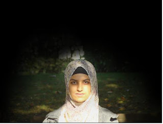
To finish it off I added the text. I have started of with the director, placed at the top of the poster. this is because it is an independent film, therefore the actor's names will not be familiar to the viewers, whereas the directors name will. I then continued by adding a tag line that is well recognised by the viewers, as it will be shown on the trailer as well as the poster "at night. . . the devil comes to mind". To finish it off i then typed the title of the film, which was in a bigger font. this was because I want it to stand out. Using white text on a black background is a common technique used to make something eye catching.

Thursday, 12 November 2009
Filming review (11/11/09)
As I had arranged to do filming yesterday, it was achievable. This was as it went all to plan and also new ideas sprung to mind while filming. These ideas I then experimented with to find out that they worked very well with the genre horror. The few shots that I experimented with were hand held cameras and moving as the actor is moving around. This was however a bit difficult, but after a few tries I became comfortable with the technique. I got a wide range of shot, with which i could use to build up tension throughout the trailer.
There was one shot that i was unable to do, this was due to the fact as I needed a few more people who wouldn't mind to be standing in the corridor with her. Therefore another arrangement will be made to complete the shots that need to done with Huma.
There was one shot that i was unable to do, this was due to the fact as I needed a few more people who wouldn't mind to be standing in the corridor with her. Therefore another arrangement will be made to complete the shots that need to done with Huma.
Wednesday, 11 November 2009
Weekly Planning 9/11/2009
Updates to my weekly plan. 
The new arrangements have been added onto Wednesday, were I will also do some filming during period 4 with Huma.
The new arrangements have been added onto Wednesday, were I will also do some filming during period 4 with Huma.
Monday, 9 November 2009

Thursday, 5 November 2009
Research on Independent Cinema
I wanted to further explore the different aspects of independent films compare to mainstream films. Research that I gathered was from a media studies revision book. The was as I wanted to come to a conclusion to whether my teaser trailer is mainstream or independent.
In my research I gathered information about independent films. It was said that "independent films will break the rules of traditional narrative and experiment with new or different ways of telling stories to create meaning in non-realist way." From this I understand that the narrative have an auteur style, this is what makes a film independent as typical conventions have been challenged by the director. One of the first film makers to move away from realist film was French director Jean-Luc Godard. He wanted to "expose the constructed nature of cinema and challenge his audience in order to make them reflect on their own lives as they watched."
Although independent films have been commercial advertised as much as mainstream films, this is what has made a few independent films successful. One of the most famous is The Blair Witch Project. It has the independent factors like unknown characters, handheld camerawork, direct address to camera, and lack of resolution.
Compared to mainstream films the narrative is used differently in an independent film, these include :-
- Action may be explicitly broken into chapters, as a novel.
- Narrative sequence is disjointed in some way.
- The narrative is not resolved.
- Well-known actors are not used.
- Audience cannot empathise with characters.
- Close-ups are not used often.
- Characters move 'outside the frame'.
Overall my teaser trailer may have aspects of both mainstream and independent films. The narrative (storyline) is mainly mainstream, this is due to the fact that the characters are represented stereotypically. However the way in which the narrative is put together has aspects of independent films, such as the flash backs, and the whole idea of it being a "dream", which leaves the narrative unresolved.
Wednesday, 4 November 2009
Teenage Magazine.
Here are a few magazines that I have decided to look at, as my targeted audience are teenagers. Therefore glamour and cosmopolitan are the main magazines that target the same audience. Both these magazines, are glamorous and give the women their confidence boost. The language used is quite informal, this gives the magazine a more relaxed and casual feel when reading.


Photoshop 2
Theses are similar photos that I would like to take for my magazine front cover. I want the actor to give a more personal appearance, as I would like the audience to feel like they have a connection, and relate with the actor. This will be done through the use of text, as it will be an interview on what she thinks about the film and also if it is relevant to her life.


Monday, 2 November 2009
Soundtrack Research
I have researched a few soundtrack for my teaser trailer, one which is particular interest to me is the soundtrack from Twilight.
Below are two YouTube clips, with the soundtrack of twilight, one of which is the original and the other is the piano version of it.
This one above is the original soundtrack for Twilight, and the one below is the piano version. Although twilight does not fall under the genre horror, it is a romantic fantasy, with adventure. The instruments used in the soundtrack give away a fairytale feel to the character, this is a similar technique that i wish to represent the main character.
The soundtrack is to long and repetitive, therefore I will be using snips of it, were I feel it is appropriate in my teaser trailer. This is because I want to give a combination of emotions for viewers, not only a fairytale atmosphere. I want my target audience to feel the fear in the eyes of the actors.
Sunday, 25 October 2009
Classification and Genre Research
Classification Research

BBFC Website:


BBFC Website :
As my film is targeted for teenagers, aged 15 - 20 years, i wanted to research what makes a film rating to be 15. The BBFC (the British Board of Film Classification) is an independent, non-governmental body, which has responsibilities over cinema since 1913, and over video since 1985. Moving image material is submitted to the BBFC for rating, where it will award a ratings certificate which identifies what audience age range the material is suitable for. Below is a print screen from the BBFC homepage, classifying what a 15 rating stands for.
Looking at this classification, it gives me a more wider understanding of what my audience would expect to see in a film rated 15. Below is a statement that I found on the website with details on what the genre horror is classified as by the BBFC.
Psychological Horror Definition
BBFC Website:
"The use of frightening elements which might scare or unsettle an audience is part of a long tradition of story telling and film making. Many children enjoy the excitement of scary sequences, but, where films are targeted at a younger audience, classifications decisions will be taken into account such factors as the frequency, length and detail of scary scenes as well as horror effects, including music and sound, and whether there is a swift and a reassuring outcome. Older audiences often pay to see a horror films because they like being frightened or shocked at such works are classified at an appropriate category to ensure that the young and vulnerable are protected from too intense an experience."
Wikipedia Website:


Thursday, 22 October 2009
Photoshop
In this photoshop session were able to experiment with photos that adapted to the genre of our product. Therefore I took a few photos that i could then experiment with on photoshop. Below is one of the photos I particularly liked, and have changed a few things through the use of photoshop, as it allowed me to put across the atmosphere and genre of the teaser trailer.
 In this image of Huma above was taken during the day, meaning there was much sunlight. this made it difficult to give the "skoopy" effect that i wish to send across to my audience. However the sunlight has made it easy for different shades to focus on the image, what i want to stand out the most. in this image i wanted to focus on the facial features. This was due to the fact that I wanted to put across the genre of the trailer which is psychological horror.
 The photo above shows the outcome of what I have done while using photoshop. I was able to make Huma the focal point of the image, due to the use of laying. Layering an image allows you to add shades or darken the picture in the ares you wish. I was able to control the darkness of the layers by changing the capacity, the higher the capacity percentage the darker the layer. To apply the layer you would have to use a brush, which also changed size. As the image size was quite big and the area that I wanted to darken was also a large amount I found it easier to use a larger brush size.
 In this image of Huma above was taken during the day, meaning there was much sunlight. this made it difficult to give the "skoopy" effect that i wish to send across to my audience. However the sunlight has made it easy for different shades to focus on the image, what i want to stand out the most. in this image i wanted to focus on the facial features. This was due to the fact that I wanted to put across the genre of the trailer which is psychological horror. The photo above shows the outcome of what I have done while using photoshop. I was able to make Huma the focal point of the image, due to the use of laying. Layering an image allows you to add shades or darken the picture in the ares you wish. I was able to control the darkness of the layers by changing the capacity, the higher the capacity percentage the darker the layer. To apply the layer you would have to use a brush, which also changed size. As the image size was quite big and the area that I wanted to darken was also a large amount I found it easier to use a larger brush size.
Monday, 19 October 2009


Subscribe to:
Comments (Atom)